
HOOH studio & norbert mayer create J.21 anatomical typeface
all images courtesy of norbert mayer, HOOH studio
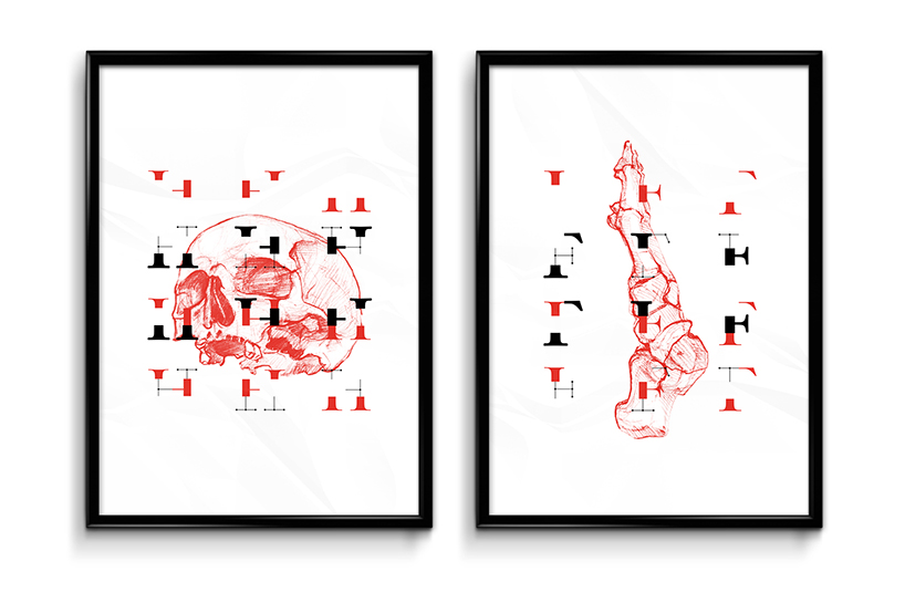
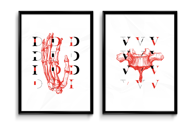
‘J.21′ posters
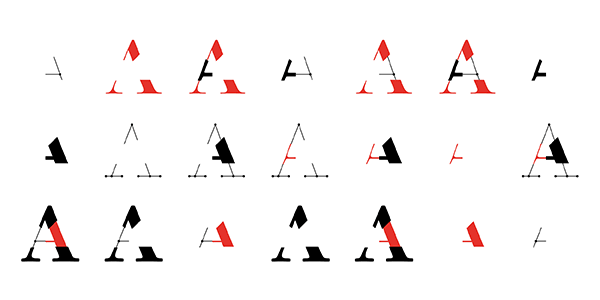
each letter and number are split into three independent versions
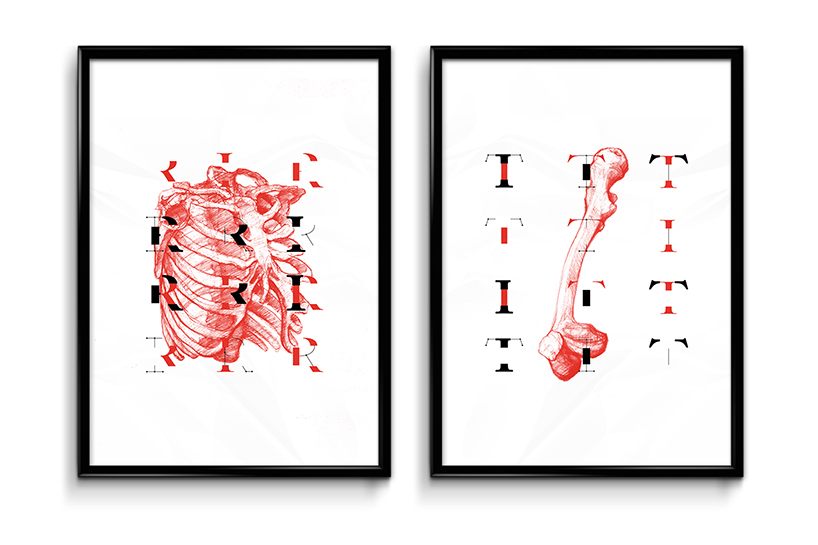
the typeface is derived from anatomy
A-gif
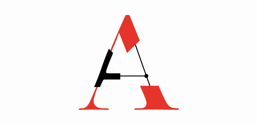
‘J.21′ A
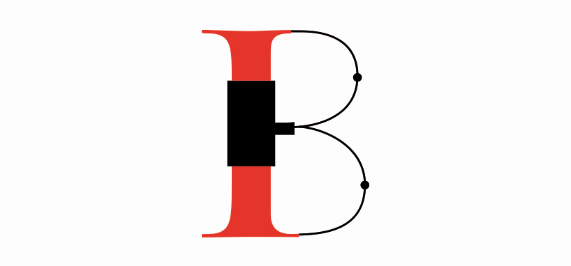
‘J.21′ B
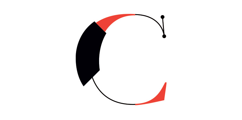
‘J.21′ C
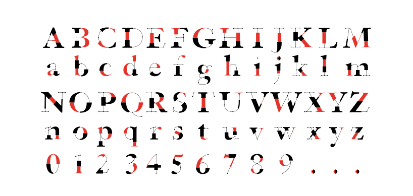
cases and numbers
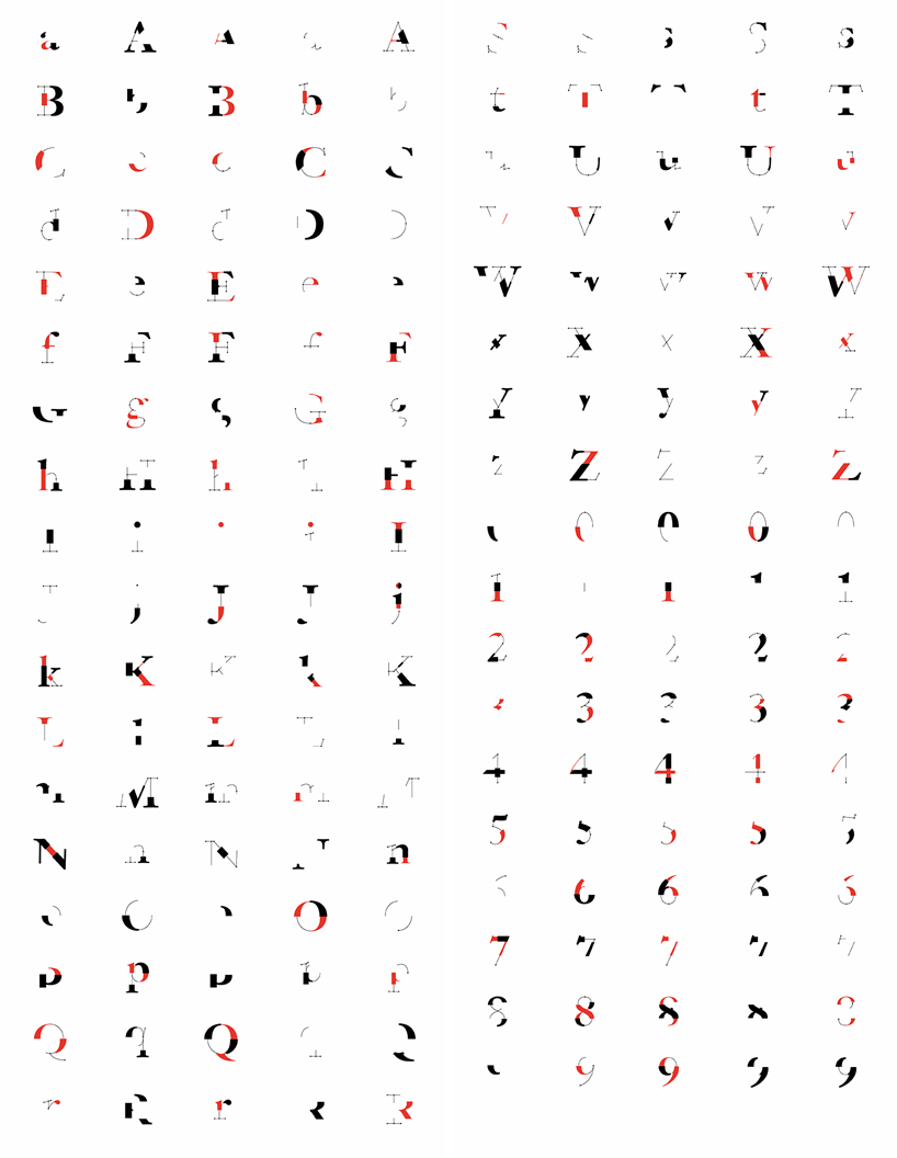
full breakdown
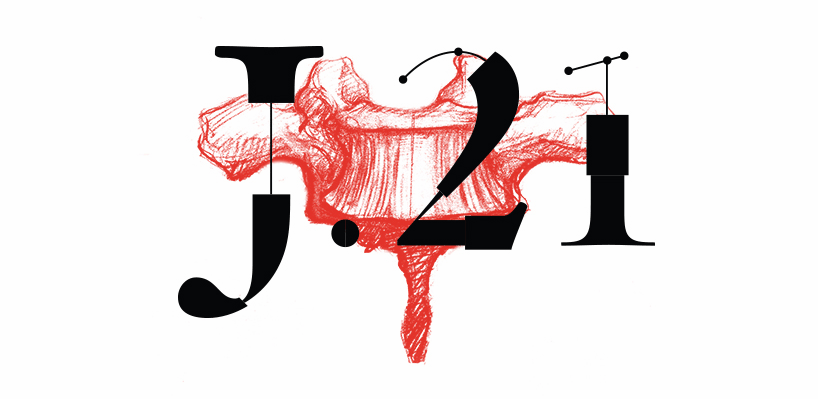
‘J.21′ logo
designboom has received this project from our ‘DIY submissions‘ feature, where we welcome our readers to submit their own work for publication. see more project submissions from our readers here.
edited by: nick brink | designboom
ทีมา : http://www.designboom.com/design/hooh-studio-norbert-mayer-j-21-typeface-08-16-2015/
แปลโดย google
แปลโดย google
HOOH สตูดิโอและ Norbert เมเยอร์สร้างอักษรกายวิภาค J.21
'J.21' เป็นแบบแยกส่วนอักษรเรขาคณิตโดยสตูดิโอและ HOOH ร์เบิร์ตเมเยอร์ ข้อความที่ได้รับอิทธิพลจากลักษณะทางกายวิภาคของมนุษย์และมีสามชั้นเป็นตัวแทนของผิวหนังกล้ามเนื้อและกระดูก ทั้งหมดมี 62 ตัวอักษรรวมถึงกรณีบนและล่างและตัวเลข แต่ละตัวอักษรและหมายเลขที่มีการแบ่งออกเป็นสามรุ่นที่เป็นอิสระแบบอักษรที่ได้มาจากลักษณะทางกายวิภาค
ไม่มีความคิดเห็น:
แสดงความคิดเห็น