
วันพฤหัสบดีที่ 21 เมษายน พ.ศ. 2559
โครงการประกวดออกแบบอักษรประดิษฐ์
โครงการประกวดออกแบบอักษรประดิษฐ์ “รางวัลนริศรานุวัดติวงศ์ในด้านอักษรประดิษฐ์”
และ ประกวดคัดลายมือภาษาไทย “รางวัล น ในดวงใจ”
Submitted by mod on Sat, 2016-02-27 18:11
มหาวิทยาลัยศิลปากร ขอเชิญนักเรียน และประชาชนทั่วไป ส่งผลงานและสมัครเข้าร่วมการประกวดออกแบบอักษรประดิษฐ์ “รางวัลนริศรานุวัดติวงศ์ในด้านอักษรประดิษฐ์” และ ประกวดคัดลายมือภาษาไทย “รางวัล น ในดวงใจ” เนื่องในงานวันนริศ ประจำปี 2559 ชิงเงินรางวัลมูลค่ารวมกว่า 80,000 บาท พร้อมเกียรติบัตร และเหรียญที่ระลึก สมเด็จพระเจ้าบรมวงศ์เธอ เจ้าฟ้ากรมพระยานริศรานุวัดติวงศ์
ผลงานเข้าร่วมประกวดออกแบบอักษรประดิษฐ์
“รางวัลนริศรานุวัดติวงศ์ในด้านอักษรประดิษฐ์”

วันพุธที่ 20 เมษายน พ.ศ. 2559


วันอังคารที่ 19 เมษายน พ.ศ. 2559
สรุปผลการเรียนรู้ วันที่ 19 เมษายน 2559
ปิดคอร์สวิชา Artd2304 การออกแบบตัวอักษรเพื่อการพิมพ์
ภาคเรียนที่ 2/2558
สรุปผลการเรียนรู้ในสัปดาห์สุดท้าย มีการแสดงและตรวจสอบผลงาน Final Project การออกแบบสร้างสรรค์และพัฒนาแบบตัวอักษรเพื่อการพิมพ์

วันนี้มีการสอบปลายภาค และประกาศผลคะแนนโดยรวม น้ำตาตกกันไปตามๆกัน
ความรู้สึกตลอดช่วงการเรียนการสอน ได้เรียนกับอาจารย์ มา3วิชา ได้รับความรู้และทักษะมากมาย ทุกครั้งที่ได้เรียนกับอาจารย์ รู้สึกเหมือนได้พัฒนาสมองทุกครั้ง^^! รู้สึกมีคุณภาพชีวิตมากขึ้น ถึงแม้ว่าหลายคนจะบ่นว่างานเยอะบ้างละ เรียนหนักบ้างละ แต่เมื่อคุณได้ใกล้ชิดกับอาจารย์มากขึ้นได้เรียนรู้กับอาจารย์บ่อยขึ้น จะรู้เลยว่าทั้งหมดที่ได้รับมันดีแค่ไหน
ขอบคุณอาจารย์ผู้สอนที่ทำให้รู้สึกถึงความอดทน และความพยายาม ที่ไม่สามารถสร้างได้ในวันเดียว ตลอด4ปี ที่ศึกษาที่นี่ เทอมนี้เป็นเทอมสุดท้ายและใกล้หมดการศึกษาแล้ว (ขอให้เทอมสุดท้ายจริงๆนะ ^^*) ความรู้สึกที่มีต่อการเรียนรู้ตลอดการเรียนที่ผ่านมา
ขอบคุณนะคะที่ทำให้การเรียนที่นี่ได้อะไรมากกว่าที่คนอื่นเข้าใจ
ขอบคุณค่ะ อาจารย์ ผศ. ประชิด ทิณบุตร.

วันนี้มีการสอบปลายภาค และประกาศผลคะแนนโดยรวม น้ำตาตกกันไปตามๆกัน
ขอบคุณค่ะ อาจารย์ ผศ. ประชิด ทิณบุตร.
โครงการออกแบบตัวอักษรเพื่อการพิมพ์
รูปแบบอักษร Sans serif fonts
ชุดอักษร Correction Tape Fonts
โดย นางสาวพิชญาณิณ สิงหนเรศ
วันจันทร์ที่ 22 กุมภาพันธ์ พ.ศ. 2559
สรุปผลการศึกษาครั้งที่5 วันที่ 9 กุมภาพันธ์ 2559
สรุปผลการศึกษาครั้งที่5 วันที่ 9 กุมภาพันธ์ 2559
- อาจารย์สอนการโคลนนิ่งตัวอักษร
- การทำงานโปรแกรมFontlab
- เรียนรู้ลำดับของตัวอักษร การวางตำแหน่งวรรณยุกต์
- การมาร์คอักษรเพื่อการจำที่ง่ายขึ้นสะดวกต่อการทำงาน การใส่สีเพื่อแบ่งลำดับของสระและวรรณยุกต์
- อาจารย์ให้ปรับแก้ไขการตั้งชื่อตัวอักษร info
- ส่งงานไฟล์โปรแกรมและ.ttf
- ออกแบบสินค้าสำหรับงานกิ๊ฟออนเดอะมูนคนละ3แบบส่งในไดร์ฟกลุ่ม
- ส่งงานFontlab ในระบบคลาสรูมโดยมีกำหนดวันเวลา กรุณาส่งให้ตรงกำหนด
- สัปดาห์ถัดไปงดการเรียนการสอนอาจารย์ไปราชการ
วันศุกร์ที่ 5 กุมภาพันธ์ พ.ศ. 2559
Vasily Klyukin models skyscraper font after the new york city skyline
vasily klyukin models skyscraper font after the new york city skyline
all images courtesy of vasily klyukin

monaco-based creative vasily klyukin has shared with us the downloadable ‘skyscraper font’, a full keyboard of uppercase letterforms that individually depict monochromatic building typologies and form a cityscape horizon when spelled out into sentences and words. each letter relates to a realistic interpretation of typical new york residences and office spaces, with graphically illustrated windows cut out as apertures in an all-black typographic shape. we spoke with klyukin about his reasons for realizing the typographic project, the creative work he is currently involved in, and his eternal love of cities.
BOOM!
designboom: can you tell us why you decided to create skyscraper font?
vasily klyukin: after I released my ‘designing legend’ album, I had some autograph-sessions where I signed my book for everyone and wrote their names with letters which look like skyscrapers. every time, I tried to make a beautiful city with the spelling of their name. then I got an idea to make such a font.
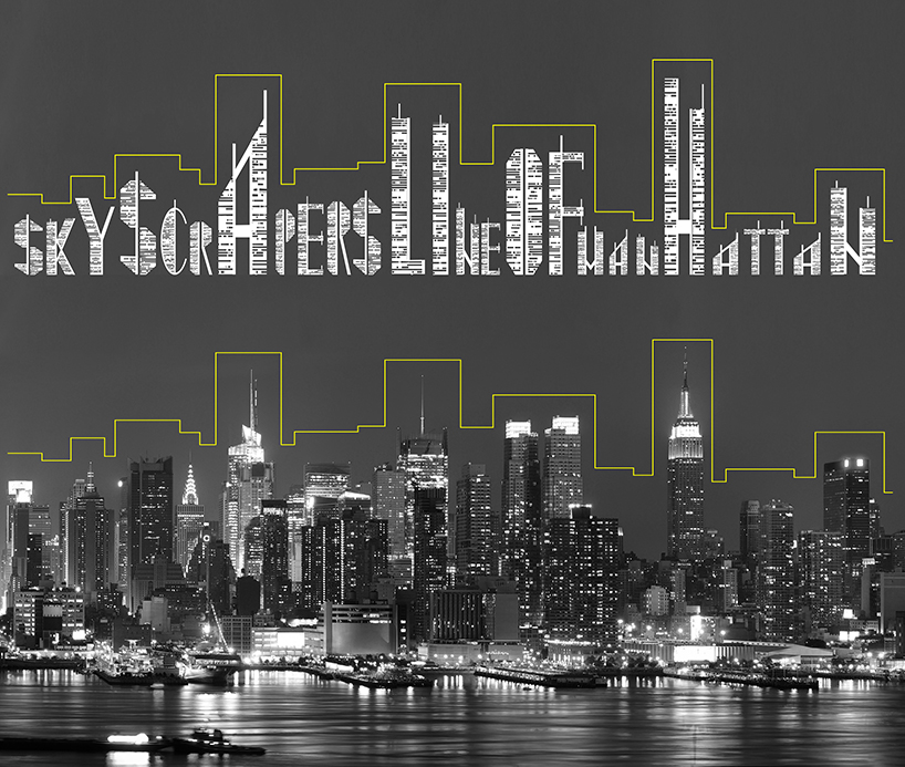
the skyscraper font follows the outline of buildings in new york city
DB: which other fonts do you particularly like?
VK: metropolis, broadway…I like complex designer fonts, but I use times new roman quite often.

the typographic elements are modeled after the shape and form of skyscrapers in new york city
DB: which other creative work you are involved in?
VK: while I don’t work with graphic software, I can make sketches, drafts and clear technical design specifications. I also create concepts of yachts and skyscrapers, I’m making a family of sculptures based on open books, I wrote a screen play, I draw cartoon characters, I made a bow tie in the shape of cat, and cufflinks in the shape of skyscraper where my office is. I have no time to implement all my ideas, which is why I wrote a fiction novel ‘collective mind’ about creative people and inventors. I described many ideas and concepts there. it’s going to be released in english next year. I created its cover which is a piece of graphic design.

the five boroughs of new york are spelled out in the skyscraper font
DB: why is it that you prefer work related to high density environments, rather than referring to nature?
VK: I think I get inspiration everywhere. I have many ideas and I spend many hours every day to visualize them. my phone is full of drawings and notes. there are hundreds — from my ideas to make a cola advertising campaign to a transforming helicopter-submarine. I also have many drafts of graffiti.

A-B-C

X-Y-Z
ที่มา : http://www.designboom.com/design/vasily-klyukin-skyscraper-font-typography-01-06-2015/
แปลโดยgoogel
Vasily klyukinได้มีแนวคิดหลังจากที่ได้รับการปล่อยตัว My Album 'ออกแบบตำนาน' ฉันมีบางลายเซ็น-การประชุมที่ผมได้ลงนามในหนังสือของฉันสำหรับทุกคนและเขียนชื่อของพวกเขาด้วยตัวอักษรที่มีลักษณะเช่นตึกระฟ้า ทุกครั้งที่ผมพยายามที่จะทำให้เป็นเมืองที่สวยงามด้วยการสะกดชื่อของพวกเขา แล้วผมมีความคิดที่จะทำให้ตัวอักษรดังกล่าว
ตัวอักษรตึกระฟ้าตามร่างของอาคารในเมืองยอร์คใหม่
อักษรรุ่นตึกระฟ้าหลังใหม่เส้นขอบฟ้าของเมืองนิวยอร์ก
แสดงให้เห็นถึงอาคาร typologies เดียวและรูปแบบขอบฟ้า cityscape เมื่อสะกดออกไปในประโยคและคำพูด ตัวอักษรแต่ละตัวที่เกี่ยวข้องกับการตีความที่เป็นจริงของที่อยู่อาศัยทั่วไปนิวยอร์กและพื้นที่สำนักงานใหม่ที่มีหน้าต่างที่แสดงภาพกราฟิกตัดออกเป็นช่องเป็นรูปพิมพ์สีดำทั้งหมด
DB: แบบอักษรอื่น ๆ โดยเฉพาะอย่างยิ่งที่คุณชอบ?
VK: มหานครบรอดเวย์ ผมชอบแบบอักษรออกแบบที่ซับซ้อน แต่ฉันจะใช้สมัยโรมันใหม่ค่อนข้างบ่อย
องค์ประกอบการพิมพ์เป็นรูปแบบหลังจากที่รูปร่างและรูปแบบของตึกระฟ้าในเมืองนิวยอร์ก
สมัครสมาชิก:
บทความ (Atom)